The client
This client got me from my youtube channel and hired me after a few rounds of interviews.
The problem
The only problem was the bad UI and UX of the website and not attracting users. Initially, its design was very old and was not promising to faith for freelancing work. So my work was to have good user research and new modern ideas about UX and UI.
Old Design

The process
Problems and solutions
- Bad UI UX: We did some user research with paid online surveys on our initial wireframes.
- No brand identity: We designed a better color scheme after some version testings.
- Very few users: Because they were not understanding the website properly. So I created better wireframes, user flows, and microtasks.
- Not had a good vision that can give return: We had many meetings, checked competitor websites. We created accounts on those websites and did research on why they are attracting users, which features we need to adapt from them, and which features they are missing. In the early days of the project, we spent a good time in this phase.
The Design system/Style guide
A good pre-defined style guide helps a lot to give a project a consistent look and feel as well as it helps in building a product quickly in the best way. We started with a new logo. Client selected this one you can see below.

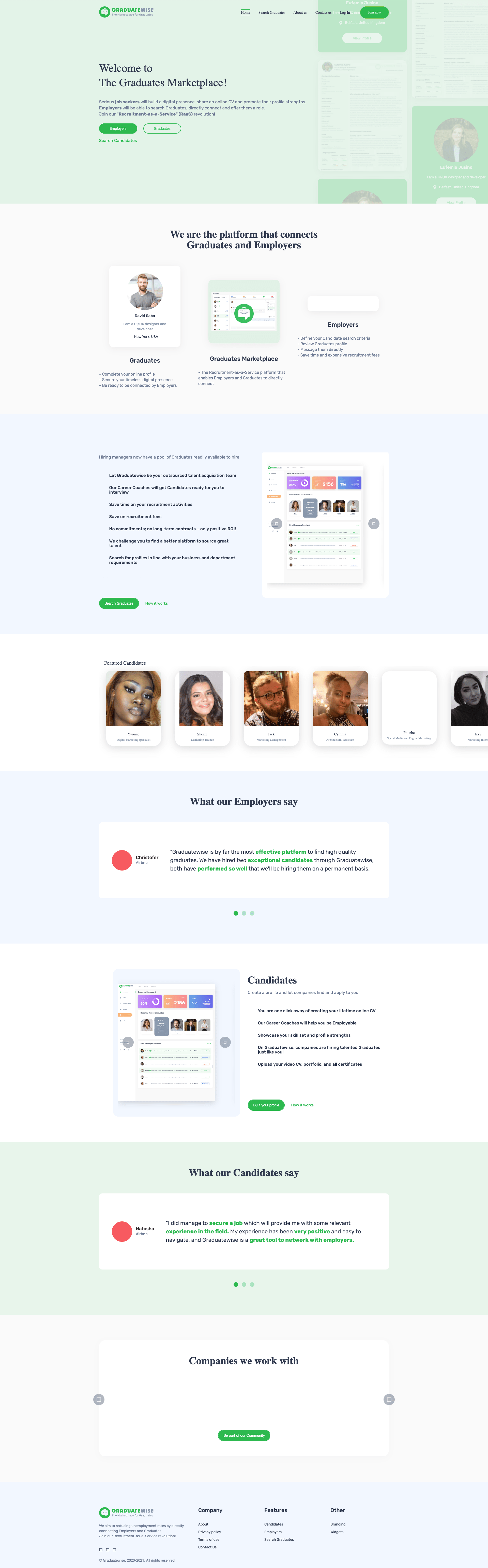
Home page
It can be seen live here, but this was finalized after few versions.
Version one
We decided to go with a single screen version like this

Version two
But after a few versions team liked this one, a long page. Please check live version here:
Employer Dashboard and other screens

Chat system

Employer profile

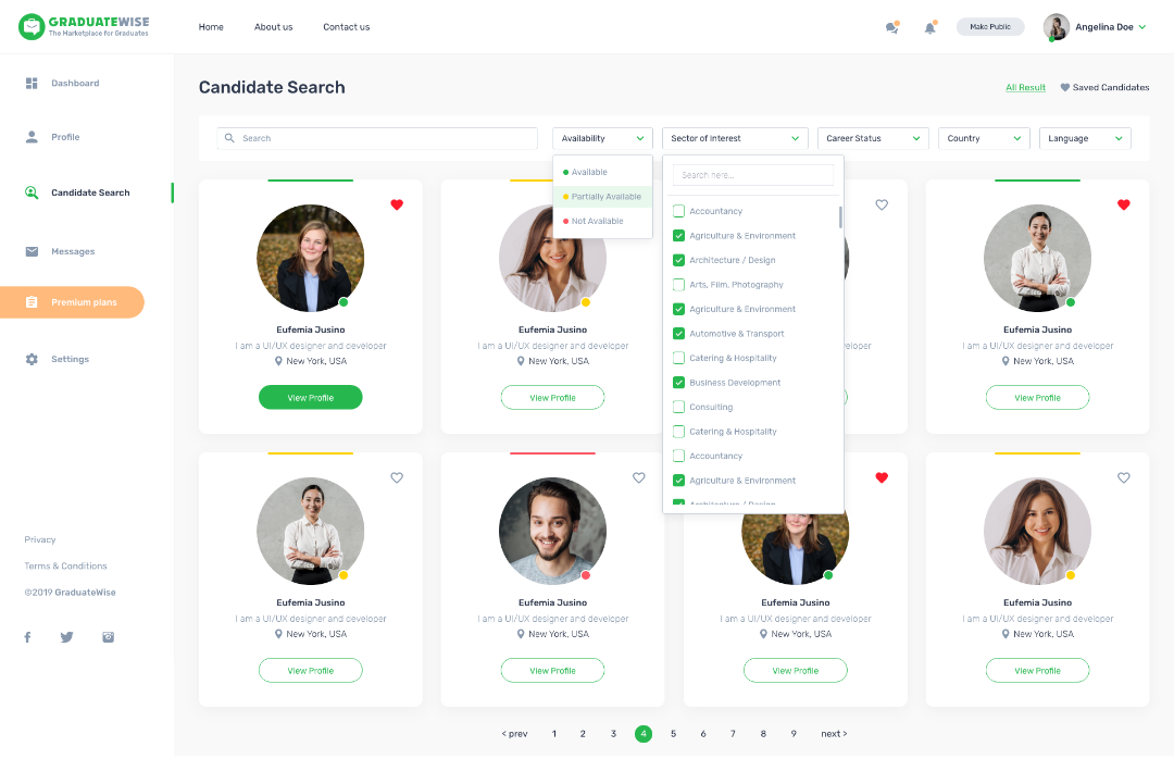
Candidate search
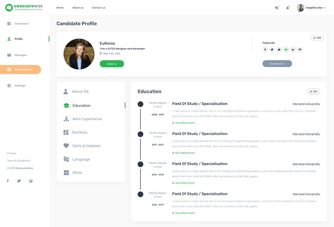
Candidate profile
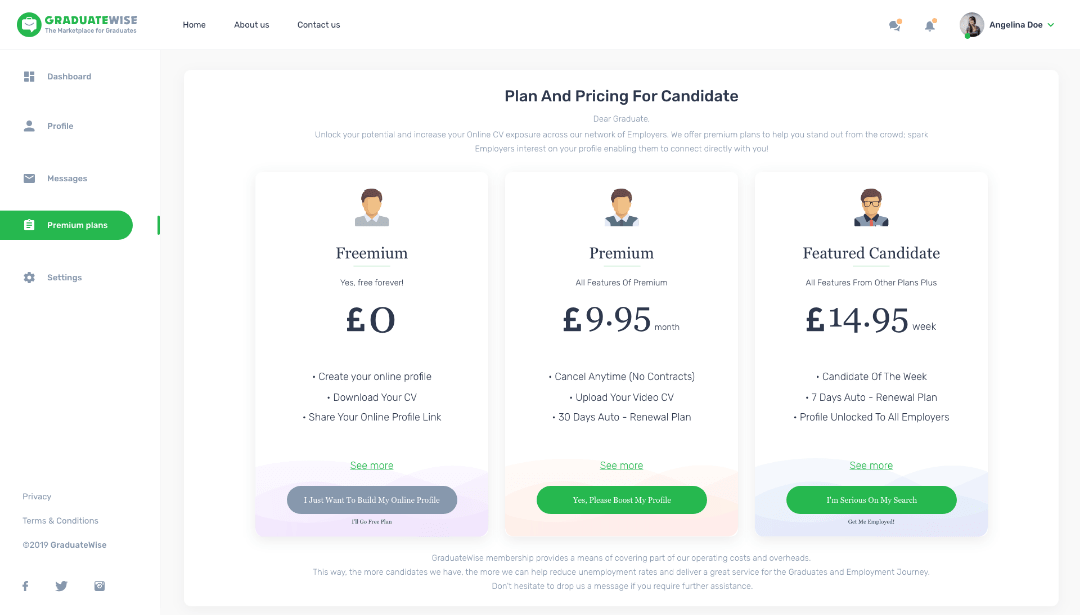
Plans page design
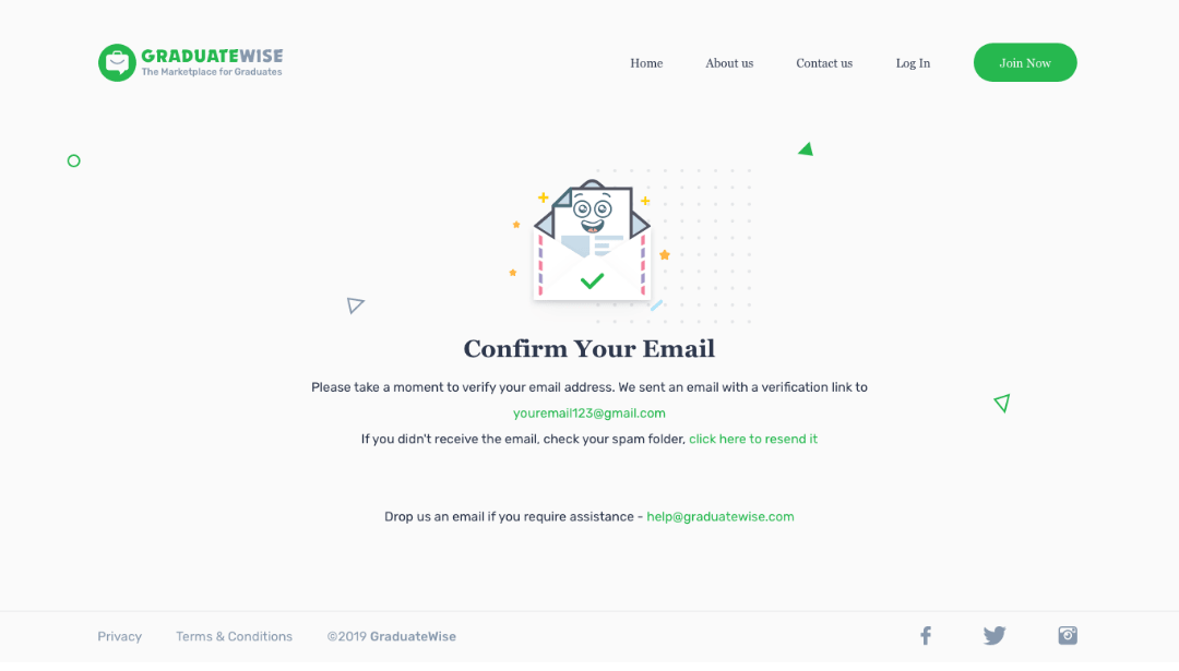
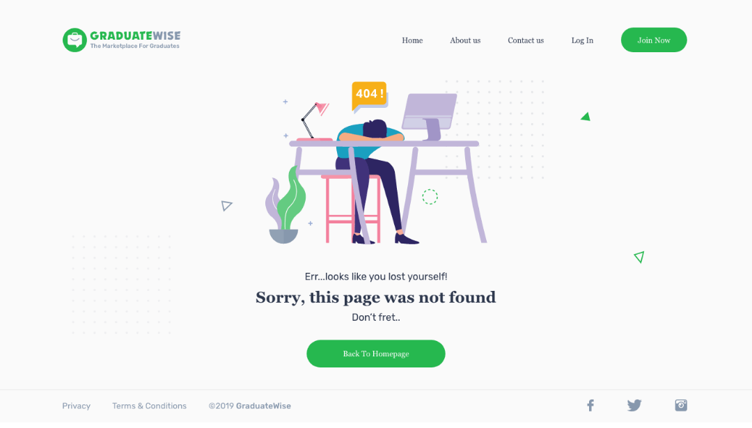
Other pages