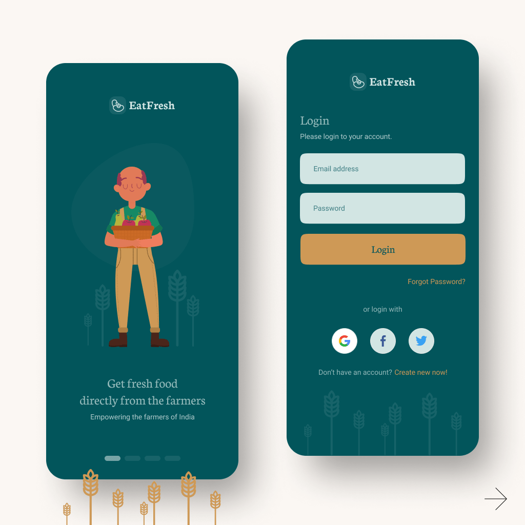
This concept was designed with Earthy + Neutral color schemes. A perfect blend of these two color themes.
This color theme was decided after 5 days of research. The green and brown shades are more close to the farmers. Representing the plants and soil.
Users of the app will feel the nature. Color psychology will do its magic on the user’s mind and thinking. These colors will make positive vibes for the app and the user will do the buying actions.
Onboarding screens and login screens are very clean without any destruction. The watermarked crop plants below the login screen giving a feeling of having something natural beyond the login screen, log in and get yourself to the farm-fresh products.


Do you have a mobile app project to discuss? Please contact me.