The Client
I worked under itenterprise.co.uk on this project and they got this project from their client from the UK itself. I am hired by itenterprise.co.uk in 2014 and continuously working for all UI needs for them. I had direct communication with the client and our team also.
The Problem/ The Project
The client wanted a very clean and minimal design specifically for visitors from the UK. So design must look familiar to the UK audience. That was the very first problem that needed a perfect solution. Now, about the actual problem. The client had some hair loss treatment plans and processes that need to be explained well in a way that it can attract the audience. And the audience can understand the benefits easily. They had some plans for different types of treatments and my job was to make UI interesting and easy to understand so that audience can interact easily and can buy the treatment plans as per the symptoms and needs. So it needed a feature “Questionnaire”.
Other than this, users can log in and check the history and plans they have bought already. And an admin panel to manage all the customers.
The Solution
The solution was not pretty straightforward and needed kickoff meetings with the team and the client. Started with listing all the problems, funneled them down to the actual needs. User research was already done for me but still did some basic level of research before starting on it.
Started with the brand guide and created a style guide for this website.
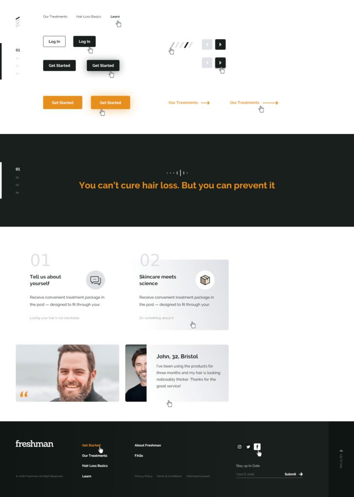
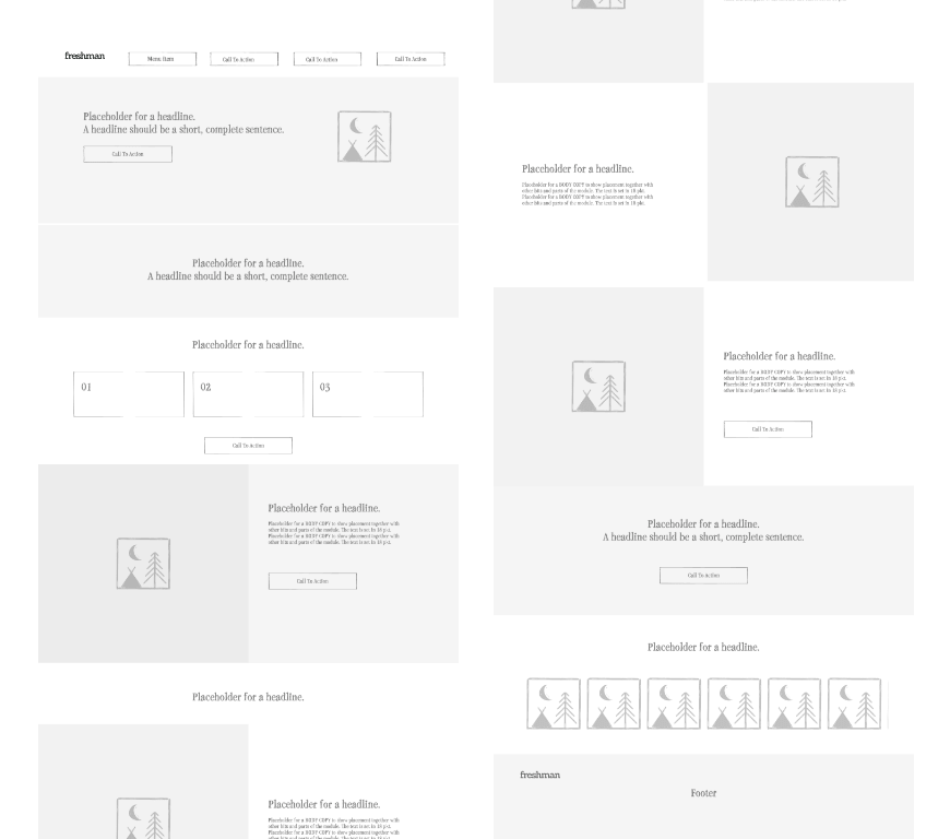
The website’s main navigation was just pretty forward. I started with a low fidelity wireframe, created some versions and after few versions, finally, one version was selected. See the versions.
Low fidelity wireframe
The final version
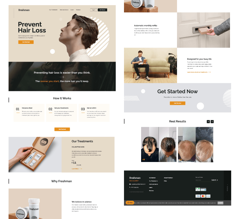
All the pages were designed in Adobe XD
All pages were designed for desktop and for mobile responsive screens.
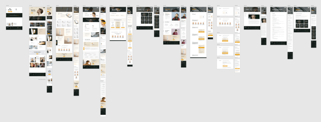
The main part was to create a quiz task flow that was to recommend which treatment plan should be given. So we created quiz user flow diagrams like this one. We called it “Freshman Embedded Recommendation Quiz”
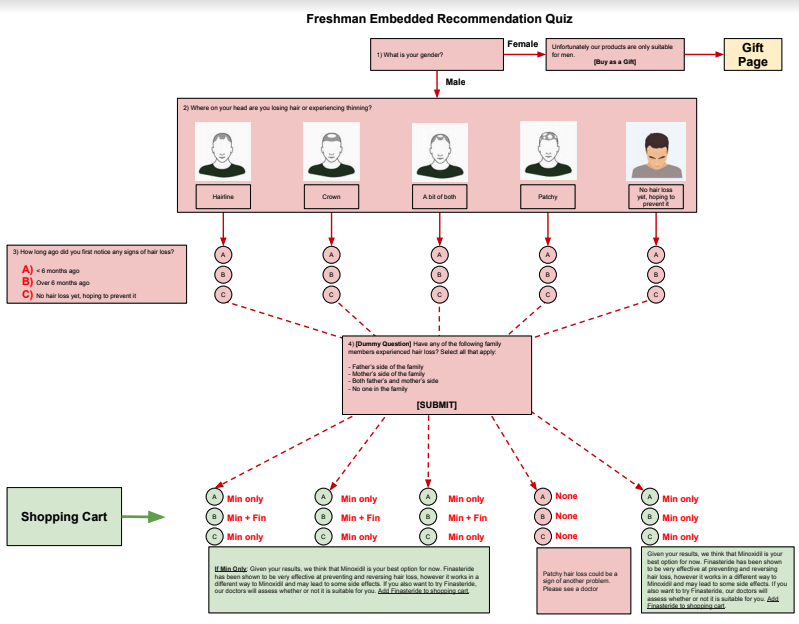
Freshman Embedded Recommendation Quiz
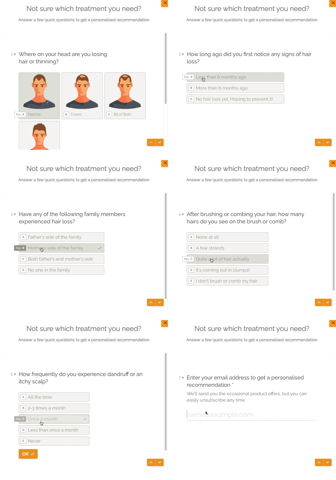
Another version for mobile
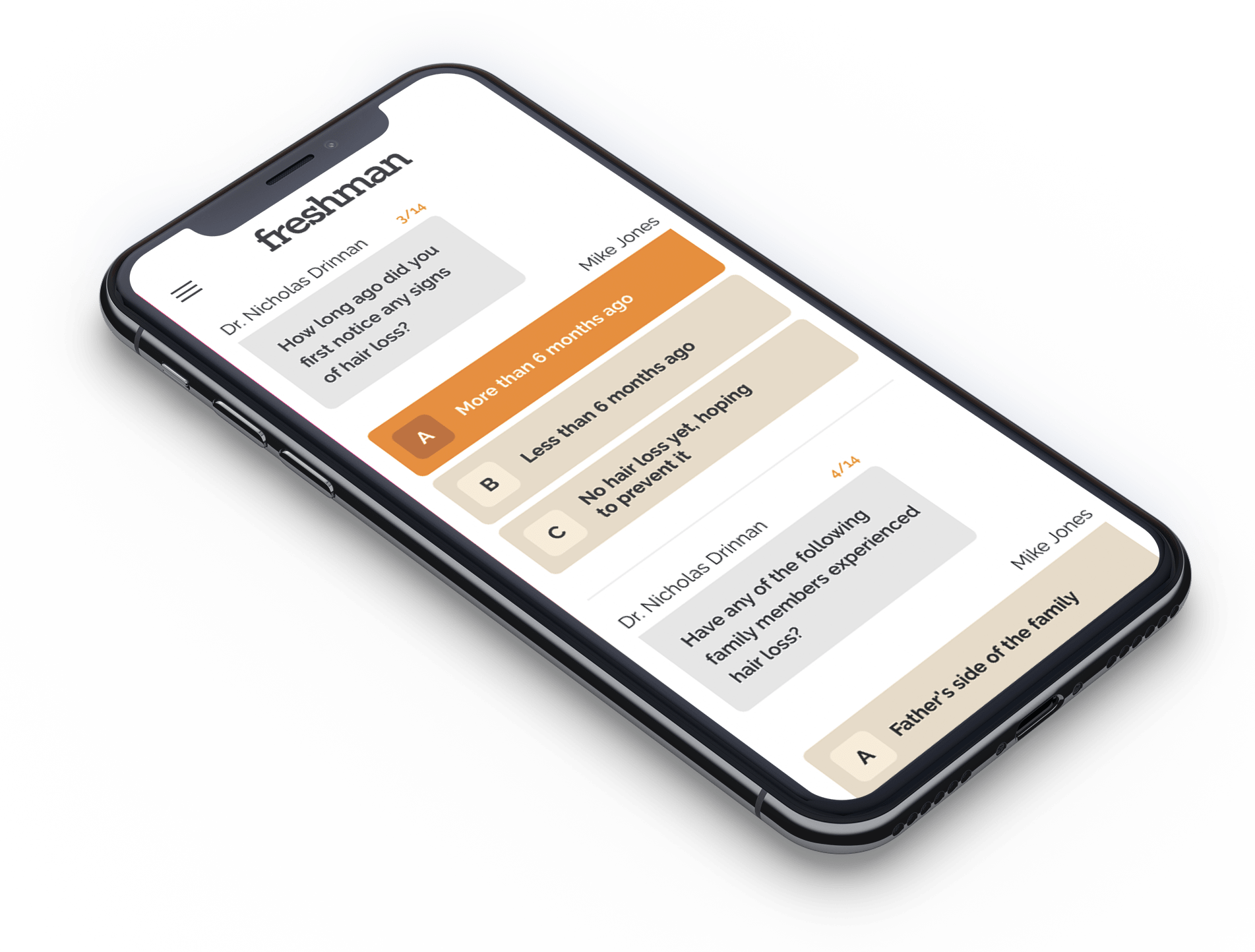
it was designed in a way that visitor should feel like a chat, real questions, and answers session
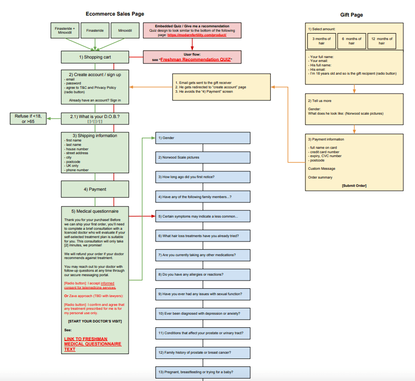
Ecommerce Sales Page planing
Very clean and easy to understand choose treatment plan section with products

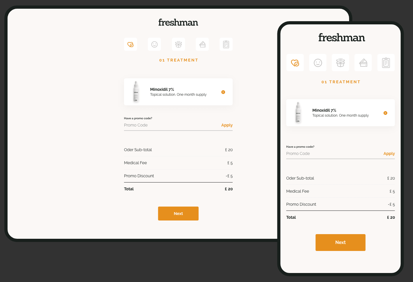
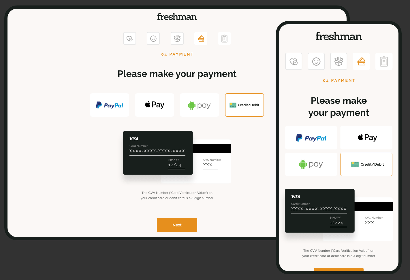
Cart screens
Till now I have created a very minimal design for the home pages and the rest of the other pages already. Now I started on shopping cart user flow screens. After few iterations on different versions we have finalized these zero distraction, very clean, and minimal product purchase flow.
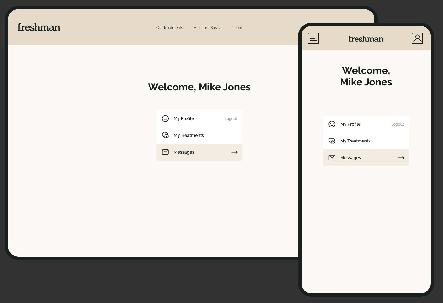
Profile dashboard screens
Now it was time to design some super minimal UI for user dashboard screens. Challenge was, it must not look like typical dashboards but it must be a minimal and clean design. See what I designed.

Final thoughts
I really enjoyed designing this website. I learned about my hidden capabilities. Although, I gave my 100% to this project but still I think I can do more better UI and UX if I have more time for deeper user research phases.
After some ups and downs to make it perfect for users, the project was done very well and it’s now live here Live Website feel free to explore what I had designed.
Do you have any branding projects to discuss? Please contact me.